About
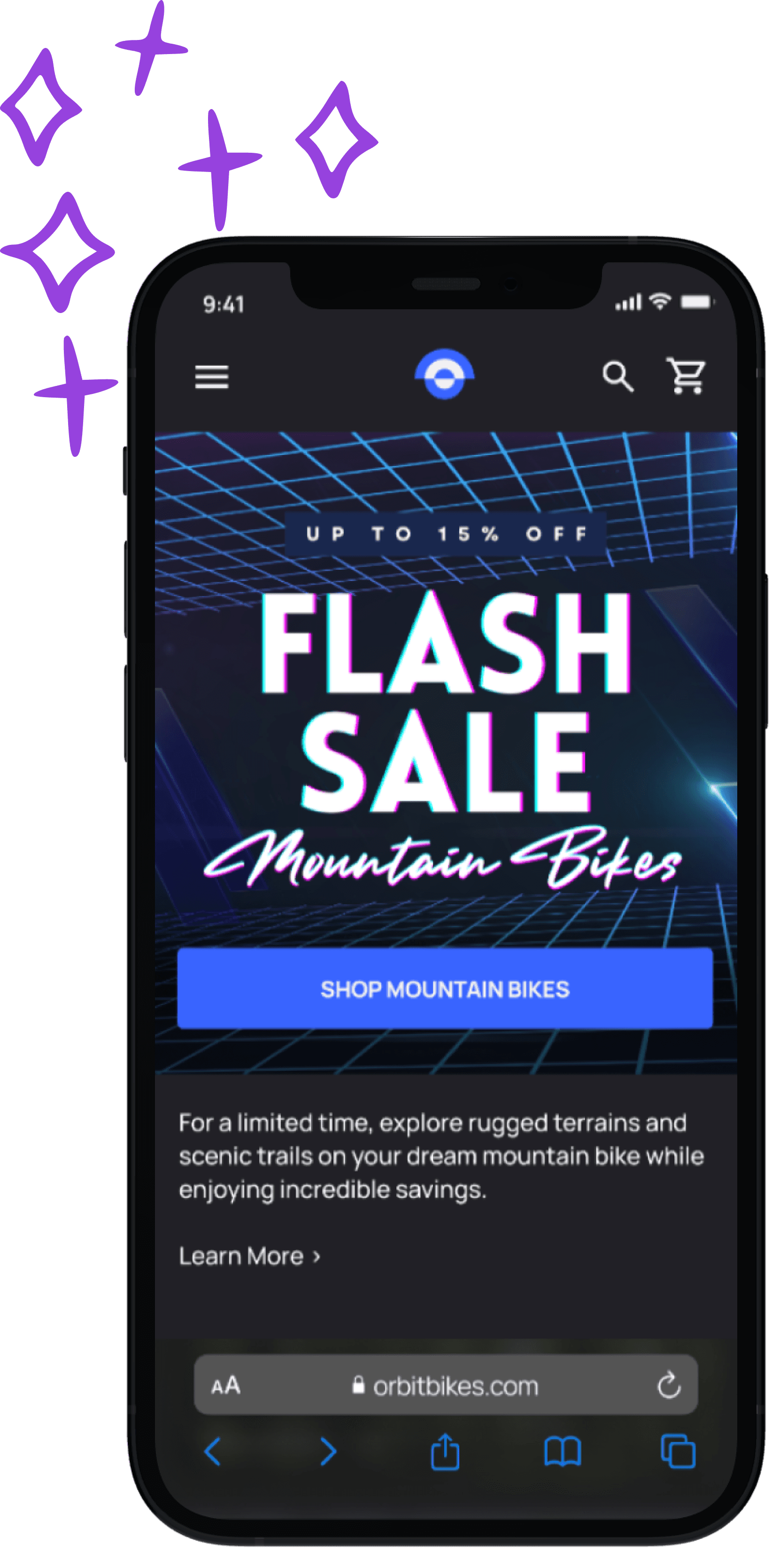
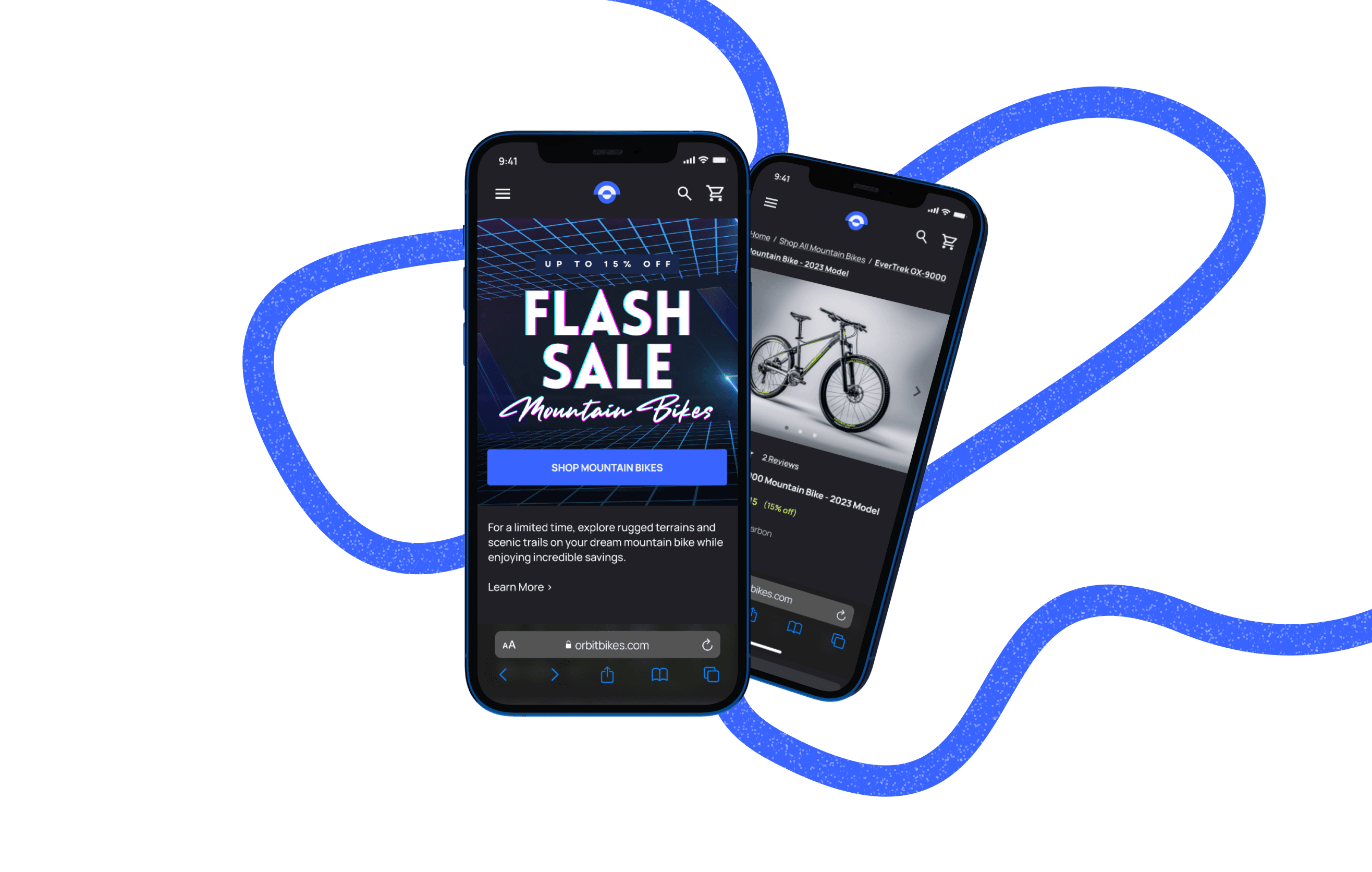
Meet Orbit Bikes, the imaginary cycling brand seeking to elevate the browsing and checkout experience for their mobile web platform.
Goals
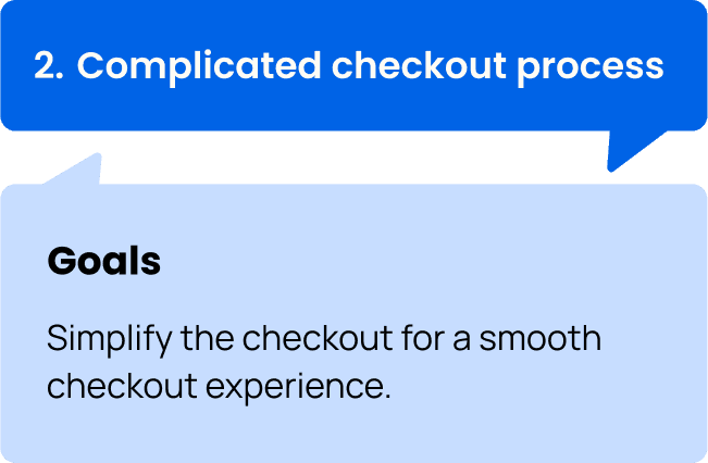
Refine the browsing and checkout process to reduce shopping cart abandonment.
Roles
Research, crafting user flows and stories, brainstorming ideas, designing user-friendly wireframes and interactive prototypes.
Design Process
01. Empathize
Secondary Research
During the empathy phase, extensive research was conducted to gain a comprehensive understanding of the factors influencing abandoned shopping carts. Utilizing a combination of five research papers and two online blogs/articles, the focus was on extracting valuable insights.
An especially intriguing article was discovered, shedding light on the subject:
on bigcommerce.com
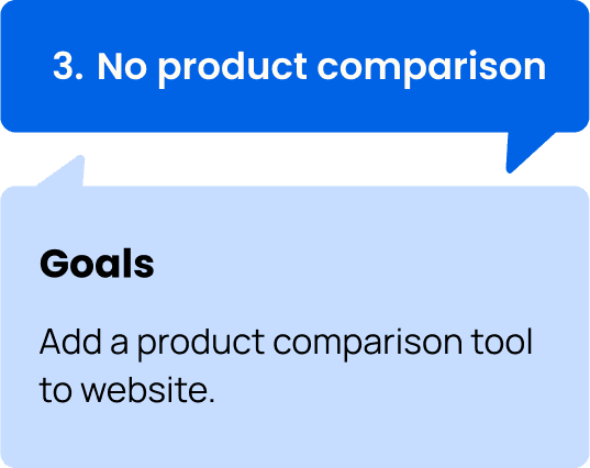
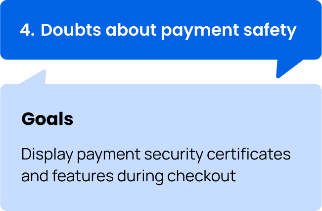
In light of the research findings, common issues were identified, and goals were established to address them.
02. Discover
User Flows
Following an exploration of user needs in the empathy phase, three primary user paths were developed to attain the design goals.
Flow 1: Browsing and Searching For A Mountain Bike
Flow 2: Comparing Products Using the Built-in Comparison Tool
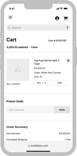
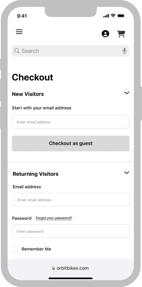
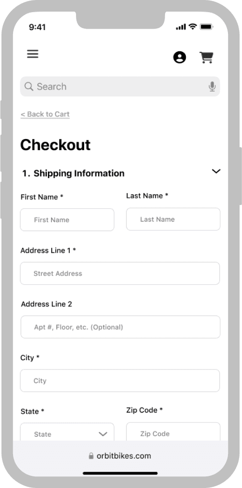
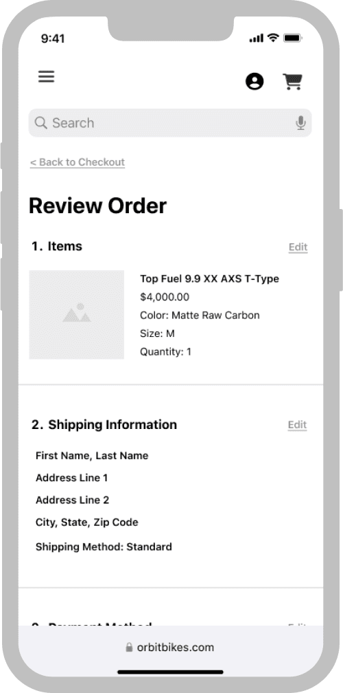
Flow 3: Completing The Checkout Process
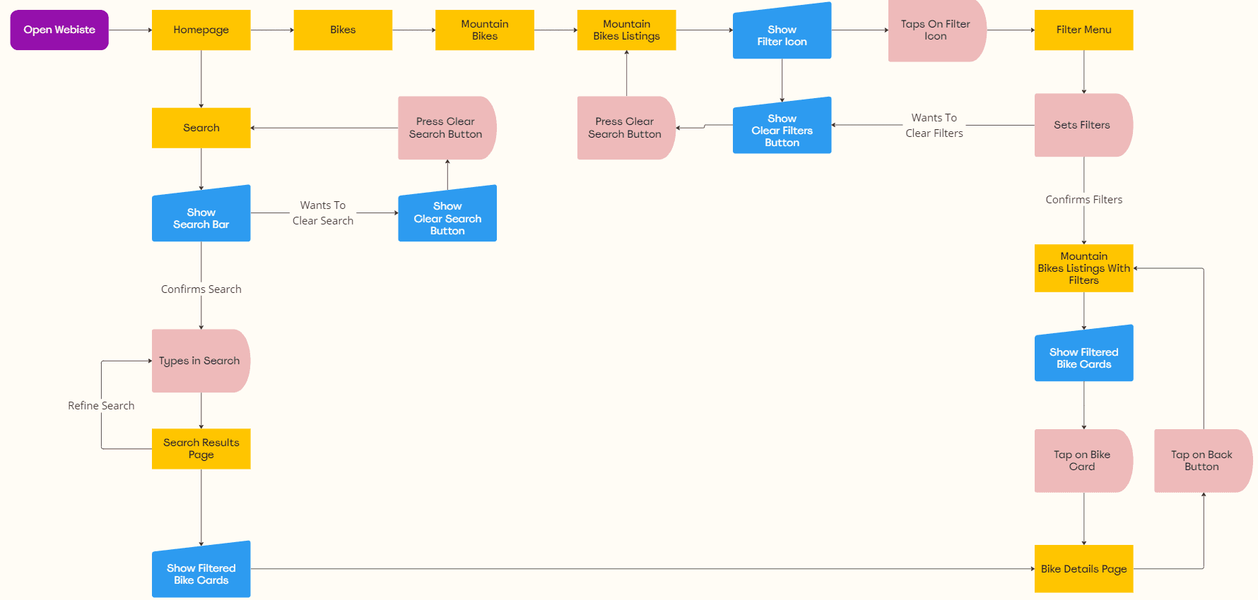
An example of the user flow for Flow 1 is presented below.
Legend
Flow 1: Browsing and Searching For A Mountain Bike
03. Define
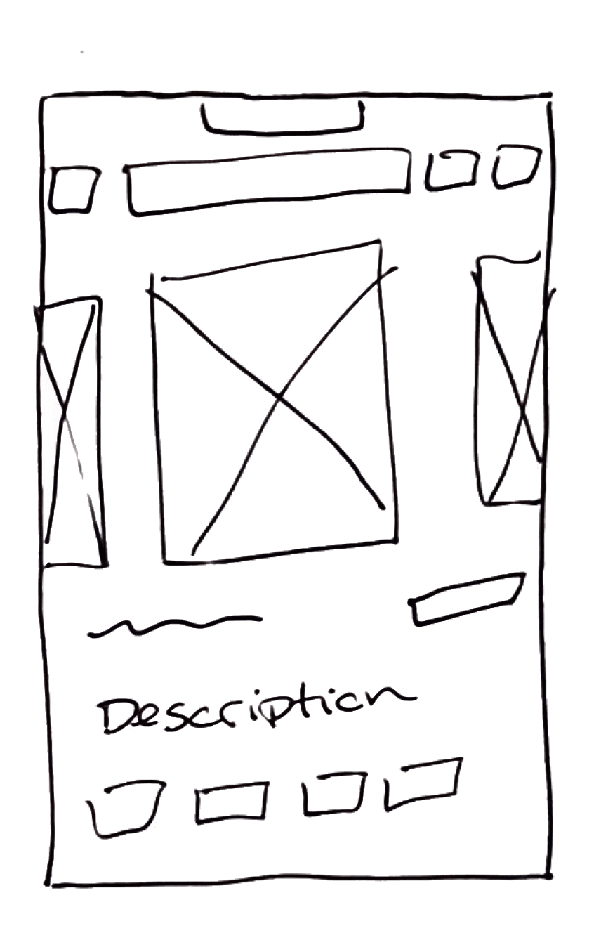
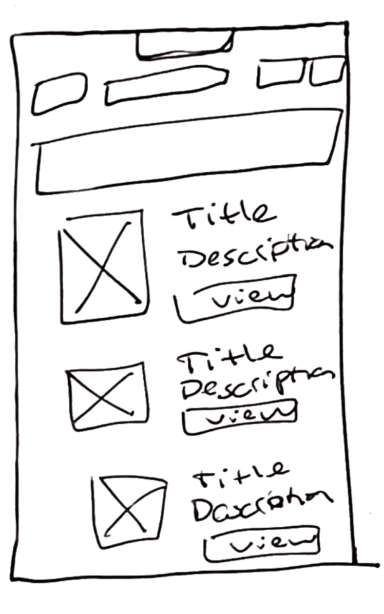
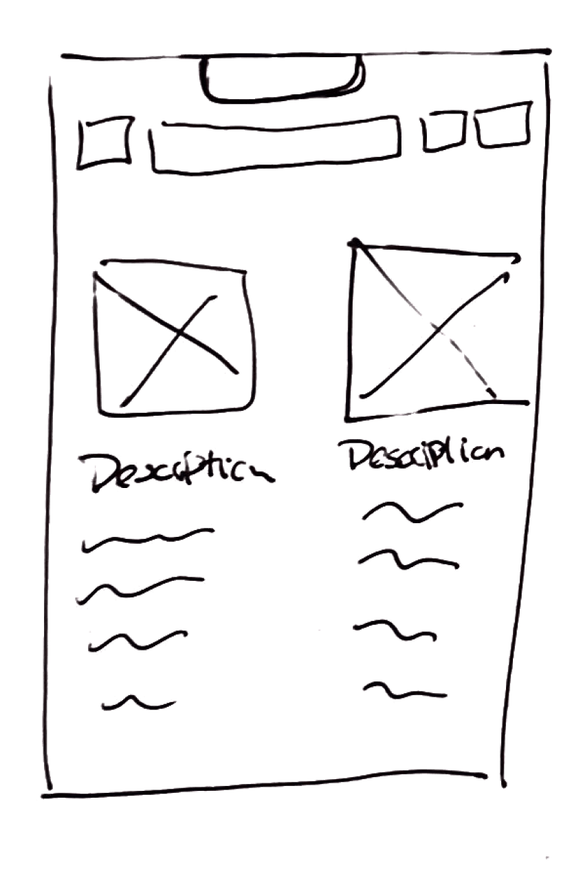
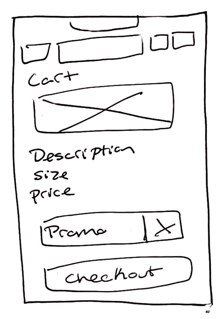
Sketches
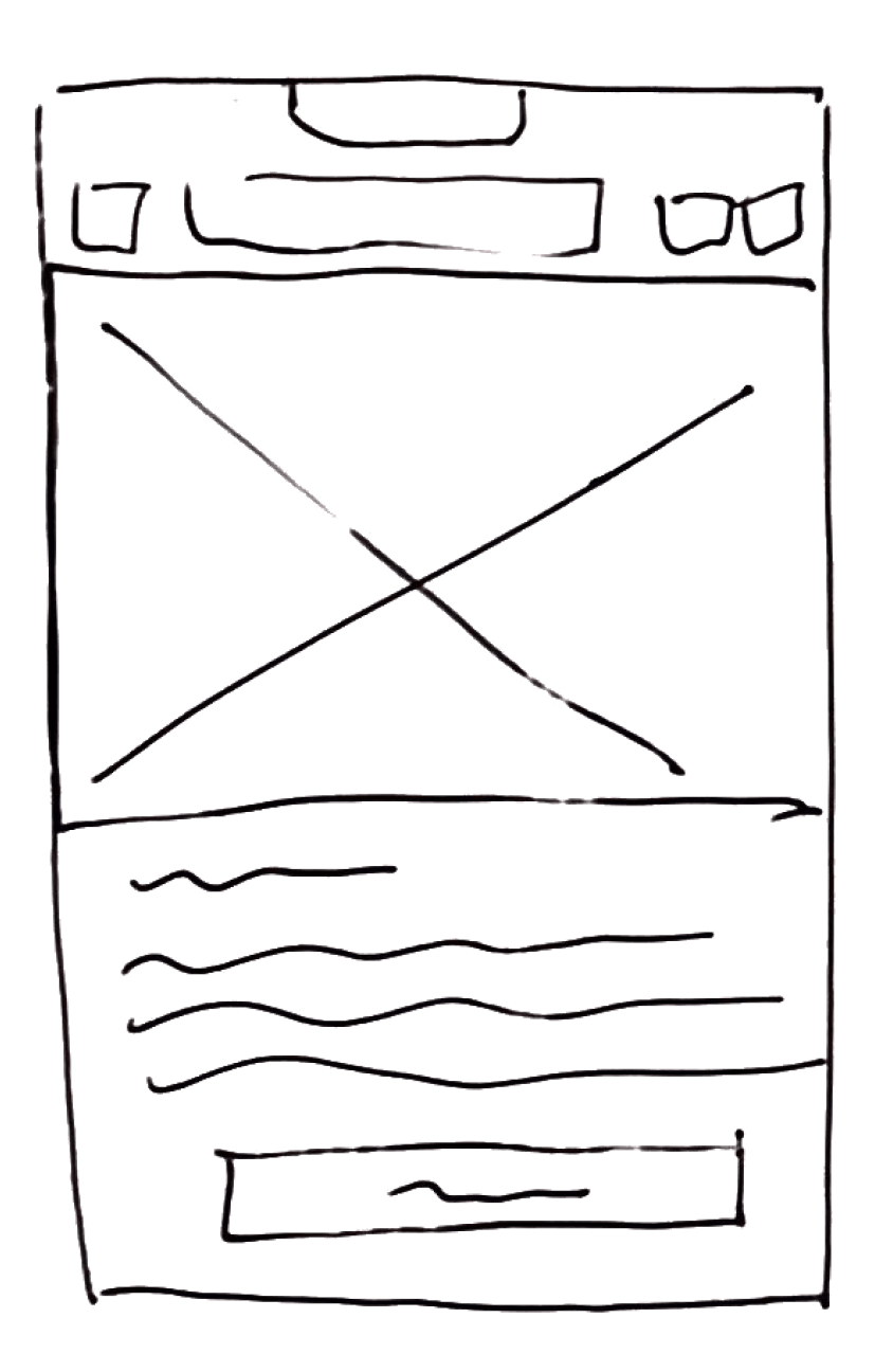
Following the creation of user flows, the process transitioned to generating preliminary sketches for essential pages in the design.
04. Design
In crafting this design, the objective was to achieve a straightforward style inspired by the celestial, aligning with the brand's goal to surpass customer expectations. The incorporation of a dark theme was considered to effectively evoke the sense of outer space, consistent with the company's branding.
Logo - Color Specs
The logo's round shape shows how its parts circle around, just like the name Orbit suggests.
A color scheme was chosen to harmonize with the cosmic theme of the company. Serene blues and vibrant greens were selected to evoke the fascination of exploring beyond our planet, reflecting the exhilarating escape that biking provides.
Colors
Fonts
The font choice for this project includes Zen Dots, selected for its modern and forward-looking appearance, seamlessly aligning with Orbit's celestial branding. Additionally, the complementary sans-serif font Manrope has been chosen.
Zen Dots - Regular
Zen Dots is the primary font for logos and titles.
A B C D E F G H I J K L M N O P Q R S T U V W X Y Z
a b c d e f g h i j k l m n o p q r s t u v w x y z
0 1 2 3 4 5 6 7 8 9
~ @ # $ % ^ & * ( ) - = < > ?
Manrope - Regular, Bold, ExtraBold
Manrope is the secondary font used for subheadlines, body text and captions.
A B C D E F G H I J K L M N O P Q R S T U V W X Y Z
a b c d e f g h i j k l m n o p q r s t u v w x y z
0 1 2 3 4 5 6 7 8 9
~ @ # $ % ^ & * ( ) - = < > ?
Title 1
Zen Dots Regular | 28px
Zen Dots Regular | 20px
Title 2
Manrope
Bold | 20px
Headline
Manrope
Bold | 16px
Subheadline
Manrope Regular | 16px
Body
Manrope
ExtraBold | 12px
Footnote
Manrope
Bold | 10px
Caption
Below is an example of a headline, subheadline, and body text.
Formatting Type
UI Icons
Google Material Icons were employed for the UI elements in this design.
05. Develop
Prototype
The prototype was developed using Figma, encompassing three essential user flows:
Flow 1: Browsing and Searching For A Mountain Bike
Flow 2: Comparing Products Using Built-in Comparison Tool
Flow 3: Completing The Checkout Process
To view full prototype, please click here
Moderated Usability Tests
The design solutions underwent usability tests involving real users. Moderated sessions were conducted with five participants, aged between 25 and 60. To facilitate testing, three user tasks were created, and examples of these scenarios are provided below.
Imagine you're a first-time bike buyer exploring Orbit Bike's website, eager to find your ideal mountain ride. Your task is to explore and identify three mountain bikes within a higher budget range.
Task 1 :
Browsing For A Mountain Bike
5/5
Users completed
the task
1:30
Average time to
completion
Having identified three suitable mountain bikes, your next step is to compare them for an informed decision. Prioritize quality by choosing the bike with the highest product rating among the three, utilizing the website's comparison tools.
Task 2:
Comparing Mountain Bikes
5/5
Users completed
the task
2:30
Average time to
completion
You've found a mountain bike that you're excited about and would like to make a purchase. Navigate through the entire checkout process smoothly, beginning with adding the bike to your cart and concluding with entering your payment information.
Task 3:
Complete The Checkout Process
5/5
Users completed
the task
2:00
Average time to
completion
Testing Insights
Throughout testing, various insights were gained about the user experience of Orbit Bikes.
Testers efficiently navigated through each page, underscoring the significance of presenting all information on every page.
Users can navigate quickly
Everyone preferred the ease of checking out without an account, finding it simpler compared to the account-required process.
Skip the sign in during checkout
Two testers easily compared bikes without using built-in features, showing not all users need every feature to find what they want.
Different ways to compare
Lessons Learned
Testers might not consistently follow the initially envisioned user journey. Instead of interrupting them, allowing testers to explore the design and form their conclusions can offer valuable insights.
Incorporating breaks is crucial for maintaining a clear mindset during the design process. Regular breaks proved helpful in navigating challenges more effectively and avoiding unproductive cycles.
The experience highlighted that UX design is a flexible and adaptable journey. Being open to exploring various solutions emerged as a key factor in fostering innovation within the design process.
